

Mastering the normal qq plot for Data Normality
You train a model, check the usual metrics, and something still feels off. The fit looks acceptable. The predictions seem mostly reasonable. Then the confidence intervals wobble, or the residuals keep misbehaving, or a simple regression starts telling a story your domain knowledge doesn't trust.
A normal qq plot holds significant value. It isn't flashy. It won't replace your model selection process. But it gives you one of the fastest reality checks in statistics and machine learning: does your data, or more often your residual structure, resemble a normal distribution closely enough for your assumptions to hold?
A lot of beginners reach for a histogram first. That's fine as a first glance. But histograms can hide subtle problems because they group values into bins. A Q-Q plot compares your ordered data directly against what you'd expect from a normal distribution, point by point. That makes it much better at showing tail issues, skew, and outliers that can subtly compromise downstream inference.
Why Visually Checking Normality Matters
You fit a model, the training finishes, and the metrics look acceptable. Then you use the results to make a pricing call, explain a feature’s effect, or defend a forecast to a stakeholder, and the confidence around those results starts to feel less solid than the headline numbers suggest.
That gap matters because many familiar methods, including linear regression and ANOVA, assume that errors behave in a roughly normal way. The model will still run if that assumption is off. The risk shows up later, when p-values, intervals, and effect estimates look cleaner than they really are.
A normal Q-Q plot helps you catch that problem early. It works like a calibration check for your assumptions. Before you trust the story your model is telling, you ask a simple question: do the residuals line up with what a normal distribution would produce, or are they bending away in a way that changes how much confidence you should place in the analysis?
Why a histogram can miss the problem
Histograms are useful, but they summarize by grouping values into bins. Small changes in bin width can make the same data look more or less normal.
A Q-Q plot is more direct. It compares your sample to the normal pattern point by point, which makes tail behavior and asymmetry much easier to spot. That matters in applied machine learning because the tails are often where trouble hides. A few extreme residuals can distort uncertainty estimates, make error analysis harder, and suggest a transformation or different model family is needed.
Practical rule: If you are going to interpret coefficients, confidence intervals, or hypothesis tests, check a normal qq plot instead of relying on a histogram alone.
Where this shows up in real ML work
This is not limited to textbook statistics. You will use a Q-Q plot in everyday model validation when you're:
- Checking regression residuals after fitting a baseline model
- Reviewing transformed targets such as log-scaled sales, wait times, or demand
- Comparing preprocessing choices to see whether one version produces cleaner residual behavior
- Sanity-checking assumptions during data preparation for machine learning
A good mental model is a preflight check. A plane can start rolling before every system has been examined, but you would not want to bet on the trip until the instruments look right. A Q-Q plot serves the same purpose for model assumptions. It gives you a fast visual check before you trust the conclusions enough to use them in production, reporting, or decision-making.
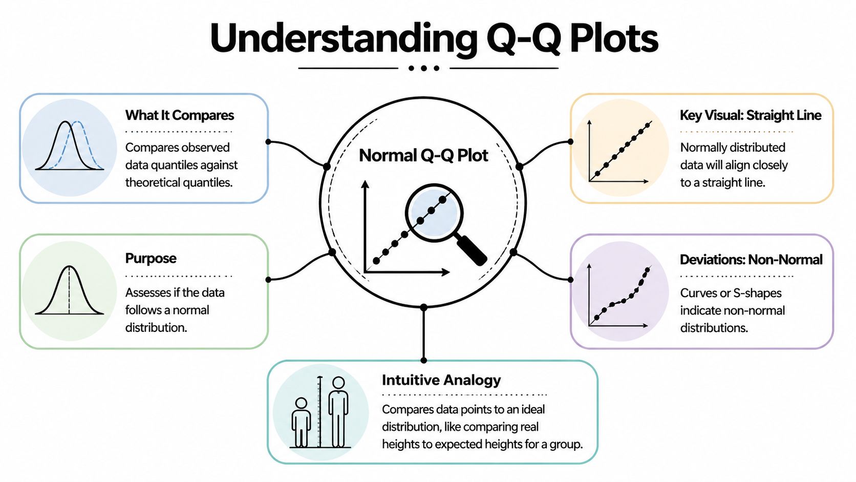
What Is a Normal Q-Q Plot Really Showing You
Suppose you trained a regression model, the accuracy looks acceptable, and now you want to know whether the residuals behave the way your statistical assumptions expect. A normal Q-Q plot answers that by lining up your data against a normal distribution and asking a simple question: do these two shapes match?
A Q-Q plot, short for Quantile-Quantile plot, compares positions in your sample with the same positions in an ideal normal distribution.
A quantile is just a location in an ordered list. The median is one quantile. Percentiles are quantiles too. If you sort your values from smallest to largest, a normal qq plot compares each ranked observation with the value that would appear at that same rank if the data were perfectly normal.
The student height analogy
A class lineup works well here. Put real students in order from shortest to tallest. Next to them, place an "ideal" class drawn from a normal pattern, also ordered from shortest to tallest. Then compare each pair by rank.
If an observed class follows a normal shape, the students at each position will be fairly close to their ideal partners. If the shortest few students are much shorter than expected, or the tallest few are much taller, those end pairs drift apart. A Q-Q plot turns that rank-by-rank comparison into a graph.
One axis contains your observed sample quantiles. The other contains the theoretical normal quantiles.
The mechanics in plain language
The construction is simpler than the name suggests:
- Sort your data from smallest to largest.
- Assign each value a position in that ordered list.
- Find the matching normal value for the same position.
- Plot the pairs and compare the pattern to a reference line.
Software does the math for you. Your job is to understand what the pairing means.
That pairing is why Q-Q plots are so useful in applied work. You are not staring at a vague shape, like you would with a histogram. You are checking whether each slice of your data, from the lower tail through the center to the upper tail, lines up with what a normal model would predict.
What the line is doing
The reference line gives your eye a target. If the points stay close to that line, your sample has a shape that is reasonably close to normal.
The line does not mean every value is correct or that the data is "good." It means the ordered pattern of the data is similar to the ordered pattern of a normal distribution. That is a narrower and more useful idea.
This distinction matters in machine learning. A model can have decent predictive performance and still produce residuals with skewed or heavy-tailed behavior. The Q-Q plot helps you catch that before you trust p-values, confidence intervals, or error assumptions that depend on normality.
A normal Q-Q plot is really a rank-matching tool. It checks whether your observed extremes, middle values, and everything between them behave like the corresponding parts of a normal distribution.
Why this becomes practical so quickly
Many beginners try to judge normality from raw numbers or from a quick glance at a histogram. That is hard. Human vision is much better at spotting whether points follow a line than deciding whether a pile of bars has the "right" bell shape.
That is why Q-Q plots show up so often in real workflows. After you fit a linear regression, test a target transformation, or compare residuals from two model versions, the plot gives you a direct visual check. If the points line up, your assumption is more believable. If they bend, twist, or peel away at the ends, you know where to investigate.
How to Read the Tea Leaves A Guide to Interpretation
A Q-Q plot gets useful the moment you stop asking, "Is this perfect?" and start asking, "How is it imperfect?" Real samples almost never sit exactly on the line. The job is to read the pattern the way a mechanic listens to an engine. A small rattle means one thing. A deep knock means another.
What you are reading is the shape of disagreement between your data and a normal distribution. That shape helps you separate skewness from tail problems, and mild noise from a real modeling issue.

Straight line and small wobble
Start with the easy case. The points follow the line closely, with a little scatter around it.
That usually means your data is close enough to normal for many practical purposes. If these are residuals from a regression model, the normality assumption is on reasonably solid ground. In an ML workflow, that gives you more confidence when you inspect confidence intervals, error summaries, or downstream statistical tests built on those residuals.
Heavy tails and the classic S shape
Heavy tails show up when the sample has more extreme values than a normal distribution would expect. On the plot, the middle may look fine while the ends peel away. The lower tail drops below the line and the upper tail rises above it, creating the familiar S pattern.
A simple way to picture it is this. The center of your data behaves like a calm road, but the edges behave like potholes. Most predictions look ordinary, then a few misses are much larger than your model setup assumed.
That matters in practice. Fraud scores, financial returns, latency measurements, and model residuals after a bad feature transformation often behave this way. The average error can still look acceptable while the rare but costly failures pile up in the tails.
The tails often reveal the risk the average hides.
Light tails and the inward bend
Light-tailed data does the opposite. Extreme values are less dramatic than the normal model expects, so both ends bend inward toward the line.
This can happen with clipped values, bounded measurements, or outputs constrained by a business rule. If a system caps predictions or trims large errors, the Q-Q plot often shows that compression clearly. The plot is useful here because a histogram may just look "tidy" while the Q-Q shape shows that the tails have been squeezed.
Skewness and the banana curve
Skewness is different from tail weight. Instead of both ends departing in a balanced way, one side drifts more than the other.
A right-skewed sample often bends upward on the right side. A left-skewed sample bends more strongly on the left. Revenue per user, waiting times, and many count-like business variables often show right skew. Test scores clustered near a maximum can show left skew.
This distinction helps you choose a fix. Tail problems may call for a model that tolerates outliers better. Skewness may point to a transformation, a different error distribution, or separate treatment of a bounded target.
A quick visual dictionary
| Pattern Shape | What It Looks Like | What It Means | Common Example |
|---|---|---|---|
| Near-straight line | Points stay close to the reference line across the plot | Data is reasonably consistent with normality | Regression residuals that behave well |
| S shape | Both ends drift away, with stronger extremes than expected | Heavy tails, more extreme values than normal | Financial returns, unstable training losses |
| Inverted S | Ends tuck inward compared with the line | Light tails, fewer extremes than normal | Bounded or clipped measurements |
| Curved upward on one side | One tail departs more than the other | Right skew | Waiting times, revenue per user |
| Curved downward on one side | Lower tail departs more strongly | Left skew | Scores piled near an upper bound |
Don't read single points in isolation
A single outlier matters less than the overall geometry. New analysts often spot one dramatic point and conclude the whole distribution is unusable. A Q-Q plot works better as a whole-pattern check.
Use a short checklist:
- Is the middle close to the line? If yes, the bulk of the distribution may be fine.
- Do both tails move away in the same general way? That often suggests a tail-weight issue.
- Does one side drift more than the other? That points toward skewness.
- Are only a few points far off while the rest behave well? You may be looking at influential observations rather than a broad distribution mismatch.
A habit that works in real projects
When you review residual diagnostics after training a model, keep the process simple.
- Read the center first.
- Check the left and right tails separately.
- Ask whether the pattern is symmetric.
- Match the shape to a likely cause.
- Decide on an action, not just a label.
That last step is the bridge from theory to practice. If you see right skew, try a target transformation and compare residual plots again. If you see heavy tails, consider a more outlier-resistant loss or review whether a few rare cases need separate handling. If you want another plotting workflow for side-by-side checks, this guide to data visualization in R is a useful companion.
A normal Q-Q plot is not a pass-fail exam. It is a diagnostic sketch. Read the shape well, and you can tell whether your model assumptions are harmless approximations or the reason your edge cases keep going wrong.
Creating Your First Normal Q-Q Plot Code Examples
A good first Q-Q plot often happens five minutes after a model run.
You fit something simple, glance at the metrics, and then ask a better question. Do the residuals behave the way your method assumes? A normal Q-Q plot is one of the fastest ways to check. The code is short, but the value comes from connecting the picture to a decision you might make next.

Python with statsmodels
If you already work in pandas or statsmodels, this version fits naturally into a notebook.
import numpy as np
import matplotlib.pyplot as plt
import statsmodels.api as sm

# Example data
x = np.random.normal(loc=0, scale=1, size=100)

# Create Q-Q plot
sm.qqplot(x, line='45')
plt.title("Normal Q-Q Plot")
plt.show()
line='45' draws a diagonal guide. Your sample points are compared against what you would expect from a normal distribution. If the dots stay close to that line, the sample shape is reasonably close to normal.
For model checking, replace x with residuals rather than raw data. That small habit turns the plot from a classroom example into a real diagnostic tool.
Python with scipy and matplotlib
SciPy gives you another compact option.
import numpy as np
import matplotlib.pyplot as plt
from scipy import stats

x = np.random.normal(size=100)

fig, ax = plt.subplots()
stats.probplot(x, dist="norm", plot=ax)
ax.set_title("Normal Q-Q Plot")
plt.show()
probplot calculates the theoretical normal quantiles and draws the plot in one call. It is handy when you want a quick check inside an existing analysis script.
If your team works across languages, it also helps to keep plotting habits consistent. A guide to data visualization in R can help when you want the same diagnostic workflow in both Python and R.
R with base functions
Base R keeps the first version very simple.
x <- rnorm(100)

qqnorm(x, main = "Normal Q-Q Plot")
qqline(x, col = "red")
qqnorm() plots the sample against normal quantiles. qqline() adds a reference line so your eye can judge departures faster. This pairing has been part of routine statistical diagnostics for a long time, which is one reason many analysts still teach it first.
R with ggplot2
If you prefer a more polished plotting workflow:
library(ggplot2)

x <- data.frame(value = rnorm(100))

ggplot(x, aes(sample = value)) +
  stat_qq() +
  stat_qq_line(color = "blue") +
  ggtitle("Normal Q-Q Plot")
This version works well in reports, faceted dashboards, and side by side model comparisons. In practice, that matters because you rarely inspect one plot in isolation. You compare several preprocessing choices, several models, or several residual sets and ask which one behaves best.
A short walkthrough can also help if you like learning visually:
One practical habit to adopt
Treat the plot like a lab note, not just a picture.
Right after you generate it, write one plain language sentence beside it. For example:
- Center follows the line, upper tail bends away
- Clear S-shape, tails are heavier than normal
- Curve rises on the right, possible right skew
That sentence forces you to practice interpretation, and it gives future you a record of why you changed a transformation, loss function, or model form. Over time, the code becomes automatic. The judgment becomes the primary skill.
Using Q-Q Plots in Machine Learning Model Diagnostics
The most useful place to apply a normal qq plot is often not on raw features. It's on residuals.
Residuals are the errors your model leaves behind. If those errors have structure, your model may be missing something important. In classical regression settings, residual normality matters because it helps support reliable inference. In broader ML practice, the plot still helps as a diagnostic lens, especially when you're comparing model forms or preprocessing choices.

A simple workflow with residuals
Suppose you fit a linear regression to predict demand. The training score looks reasonable. Then you draw a Q-Q plot of residuals and notice the upper tail peeling away from the line.
That pattern tells you the model is underestimating some large outcomes more often than a normal-error assumption would suggest. Now you have a clue. Maybe the target needs a transformation. Maybe a key feature has a nonlinear effect. Maybe a different model family fits better.
Here's a compact Python example:
import numpy as np
import matplotlib.pyplot as plt
import statsmodels.api as sm
from sklearn.linear_model import LinearRegression

# Example synthetic data
rng = np.random.default_rng(42)
X = rng.normal(size=(200, 1))
y = 3 * X[:, 0] + rng.normal(size=200)

# Fit model
model = LinearRegression()
model.fit(X, y)

# Residuals
preds = model.predict(X)
residuals = y - preds

# Q-Q plot of residuals
sm.qqplot(residuals, line='45')
plt.title("Q-Q Plot of Model Residuals")
plt.show()
How the plot guides model decisions
A residual normal qq plot won't tell you exactly which fix to choose. It does help narrow the options.
Here are common responses:
- Skewed residuals often suggest transforming the target or adding missing nonlinear structure.
- Heavy tails may point to outliers, unstable data-generating processes, or a model that misses rare but important cases.
- Systematic curvature can hint that the model form is wrong, even if average error metrics look decent.
- A mostly straight line with a few extreme points may call for investigating influential observations rather than rebuilding everything.
Mentor's shortcut: If your Q-Q plot looks bad and your residual-vs-fitted plot also looks patterned, trust the combination. The model is telling you it wants a different shape.
Q-Q plots beyond simple regression
This tool still helps in modern AI, even when normality isn't a formal requirement in the old textbook sense.
You can use it to inspect:
- Prediction errors from baseline regressors
- Calibration residuals in forecasting pipelines
- Embedding projections when you're checking distributional assumptions
- Anomaly detection scores before choosing thresholds
For more advanced AI settings, the simple univariate plot can become too limited. The verified guidance notes that for modern AI, projected QQ or kernel density QQ alternatives are useful, and that a projected future development states Python's pingouin 0.7.0 in Q1 2026 adds multivariate QQ, detecting 25% more anomalies than univariate methods according to the Learning Tree discussion of Q-Q interpretation. Since that is a future-dated development, treat it as a directional signal rather than a current default in every production stack.
If you're building a practical toolkit for diagnostics, it also helps to know the broader ecosystem of Python libraries for data analysis, because Q-Q plotting often sits alongside pandas, SciPy, statsmodels, scikit-learn, and visualization tools in one workflow.
A healthy mindset for ML teams
The normal qq plot doesn't exist to prove your model is perfect. It exists to reveal the mismatch between your assumptions and your data. That's valuable because most real model improvements don't come from one magical algorithm switch. They come from a chain of small diagnostic wins.
A well-read Q-Q plot can be one of those wins. It can tell you when your residual story is clean, when your tails are risky, and when your model is subtly asking for a second draft.
Common Pitfalls and Advanced Best Practices
The biggest trap with a normal qq plot is overconfidence. People either trust it too much or dismiss it too quickly.
A beginner often sees a tiny wobble and concludes the data is non-normal. Another person sees obvious curvature and waves it off as "close enough." Both mistakes come from reading the plot as a vibe check instead of a diagnostic tool.
Pitfall one is treating every deviation as serious
Small samples can look lumpy even when the underlying population is normal. The verified guidance notes that visual interpretation is vulnerable to bias, and some normal samples can appear curved just by chance.
So don't punish a dataset for minor drift. Look for stable pattern, not perfection.
Pitfall two is using only your eye
Visual QQ plots are prone to subjective bias. A useful counterweight is a formal test such as Anderson-Darling. The verified guidance states that the AD test can reject normality at p < 0.05 for n > 50 with critical values around 0.78, offering a statistical check on visual interpretation as described in the ArcGIS discussion of normal Q-Q plots and related diagnostics.
That doesn't mean you should replace the plot with a single test statistic. It means you should combine them.
Use the plot to see the shape of the problem. Use the test to check whether the departure is strong enough to matter statistically.
Pitfall three is checking the wrong thing
In modeling work, raw variables don't always need to be normally distributed. Often it's the residuals or a specific transformed quantity that matters more.
If you check only the raw feature distribution, you can end up solving the wrong problem.
Best practices that make you look more professional
A stronger workflow usually includes a mix of visual and quantitative checks:
- Start with the normal qq plot to locate where departures occur
- Pair it with a histogram or density plot to keep intuition grounded
- Add a formal test when the decision matters
- Inspect residual plots alongside Q-Q plots instead of treating normality in isolation
- Use confidence envelopes when available because they help separate random wiggle from meaningful departure
A practical decision rule
If the line is mostly straight and your other diagnostics look healthy, you probably don't need to chase tiny imperfections.
If the plot shows clear curvature, tail inflation, or asymmetry and those patterns match other warnings in your workflow, act on it. Transform the variable, reconsider the model form, or use a method less sensitive to normality assumptions.
The mature habit isn't asking, "Is this perfectly normal?" It's asking, "Is this normal enough for the decision I'm making?"
Your New Superpower for Data Sanity
A normal qq plot gives you something rare in data work. A fast visual check that is both intuitive and technically meaningful.
It shows whether your ordered data behaves like a normal distribution, where the mismatch appears, and what kind of mismatch you're dealing with. That's useful when you're learning statistics, fitting your first regression, or diagnosing residuals in a real machine learning workflow.
The bigger lesson is simple. Don't just trust model output because the code ran. Look at the shape of the errors. Look at the tails. Ask whether your assumptions still make sense.
That habit scales beyond one chart. It becomes part of a broader discipline of checking and maintaining trustworthy data systems. If you're thinking about that bigger operational picture, this guide on managing data quality at scale is a worthwhile companion resource because diagnostics are most powerful when they're part of a repeatable quality process.
Once you get comfortable reading a normal qq plot, you stop seeing it as a niche statistics graphic. You start seeing it as a quick conversation with your data. And that's a real superpower.
If you want more practical, beginner-friendly AI guides that connect core concepts to real tools and workflows, explore YourAI2Day. It’s a solid place to keep building your intuition without getting buried in jargon.