

How to Create a Boxplot in R: A Beginner’s Guide
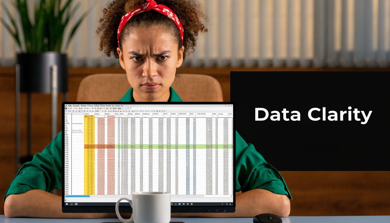
You’ve got a dataset open in R, maybe a CSV from a product experiment, maybe model output from an AI workflow, and the rows just keep going. You scroll, sort, glance at a few columns, and still don’t have a feel for what the data is doing. That’s a normal place to start.
A boxplot in r helps you get unstuck fast. Instead of reading raw values one by one, you get a compact visual summary that shows where the middle of the data sits, how spread out it is, and whether any values deserve a second look. It’s one of those charts that feels simple at first, then becomes more useful the more analysis work you do.
If you’re still getting comfortable with exploratory analysis, it can also help to review the statistics behind these visuals. A concise resource for that is this guide to exam prep for probability students, especially if quartiles and spread still feel a bit abstract. And if your data is still sitting outside R, getting it in cleanly is the first win. A practical walkthrough on importing CSV files into R can save you time before you even start plotting.
From Data Chaos to Clear Insights
You open a dataset from an experiment, sort one column, then another, and still cannot answer a simple question: which group looks better? Raw tables are good for storage. They are poor at giving quick judgment.
A boxplot helps turn that pile of numbers into something you can act on.
For a beginner in data science, its core value is not the chart itself. It is the faster decisions that come from it. A boxplot helps you compare features across categories, flag unusual values before they distort a model, and notice when one group is stable while another is all over the place. It works like a shortlist of what deserves your attention first.
A junior analyst I worked with ran into this during an experiment review. She had model scores for several groups and kept asking which version was strongest. The spreadsheet contained the values, but not the pattern. Once she plotted each group, the useful questions became obvious. One group had a higher middle score. Another had wider spread. A third had a few odd points that needed checking before anyone trusted the result.
That is the practical "so what?" of a boxplot. It helps you move from scanning numbers to deciding what to investigate.
Why beginners keep coming back to boxplots
Different charts answer different questions. Histograms help you inspect shape. Scatterplots help you inspect relationships. Boxplots help you compare distributions quickly, especially when you have one numeric variable across several groups.
In everyday R work, that usually means questions like these:
- Feature comparison: Which numeric feature looks meaningfully different across categories?
- Outlier review: Which values should you inspect before training or tuning a model?
- Spread check: Which group is consistent, and which group is noisy?
- Sanity check: Does anything look skewed, uneven, or suspicious enough to clean first?
If your data is still sitting in a spreadsheet, a quick guide to importing CSV files into R can help you get to the plotting stage faster.
If quartiles, spread, or outliers still feel fuzzy, this exam prep for probability students resource is a useful refresher before you start reading boxplots with confidence.
Why this matters in day-to-day R work
R includes a built-in boxplot() function, which is one reason boxplots are often a beginner's first serious distribution chart. You can create one in base R with very little code, then switch to ggplot2 later if you want cleaner styling for reports or dashboards.
That matters because the skill carries over. Learn how to read one boxplot well, and you can reuse that habit in exploratory analysis, feature screening, and result checking across many projects.
What a Boxplot Shows You
A boxplot turns a long column of numbers into a quick visual check. If a table is the raw ingredient list, the boxplot is the first taste test. You can spot where most values sit, how spread out they are, and which points deserve a second look before you build a model or compare features.
That practical part matters. For a beginner in data science, a boxplot is less about memorizing quartiles and more about answering useful questions fast. Which feature is stable? Which group looks noisy? Which values might be data entry errors, rare cases, or real but unusual observations?
The five values that matter
At the center is the five-number summary:
| Part | What it means |
|---|---|
| Minimum | The smallest non-outlier value shown by the whisker |
| Q1 | The first quartile, or the 25th percentile |
| Median | The middle value, or 50th percentile |
| Q3 | The third quartile, or 75th percentile |
| Maximum | The largest non-outlier value shown by the whisker |
The box runs from Q1 to Q3, so it holds the middle 50% of the data. The line inside the box is the median. That line often gives a more dependable center than the mean when a few extreme values pull the average up or down.
The distance from Q1 to Q3 is the interquartile range, or IQR. A simple way to read it is this: the IQR shows how wide the middle of your data is. A short box means the typical values are packed closely together. A tall box means they are more spread out.
What the whiskers and dots mean
The whiskers extend beyond the box to show the range of values that are still considered typical under the plotting rule R uses by default. Values far enough beyond that range appear as separate points.
Those dots are often the first thing beginners notice, and for good reason. They are not automatically mistakes. They are flags.
A boxplot shows where to investigate first, not what conclusion to draw.
In practical work, that can change what you do next. If one feature has many outliers, you might inspect the raw rows, check units, or consider a transformation before modeling. If one group has a much longer upper whisker than the others, that group may contain occasional high values that affect business decisions or model behavior.
What you can learn at a glance
Once you know the parts, the visual starts to read like a summary report:
- Higher median: typical values are larger in that group.
- Taller box: the middle half of the data varies more.
- Median closer to the bottom or top of the box: the distribution may be uneven.
- Longer whisker on one side: one tail stretches farther than the other.
- Many dots beyond the whiskers: inspect unusual observations before treating them as noise.
One detail trips people up a lot. The height of the box shows spread, not sample size. A wider spread does not mean more rows. It means the values in the middle half are less tightly clustered.
Why boxplots are so useful early in analysis
Boxplots are a common starting chart because they help you compare distributions without much setup. One plot can show center, spread, possible skew, and unusual values at the same time. That is a strong return for a simple graphic.
For beginners, the core value is the "so what?" behind the picture. A boxplot can help you decide whether a feature is worth comparing across categories, whether outliers need review before training a model, and whether one variable looks stable enough to trust as-is. It does not replace deeper analysis, but it gives you a fast, reliable first pass.
Your First Boxplot in R with Base Graphics
You have a dataset open, a few columns look suspicious, and you need a fast read before you clean anything or compare features. That is a perfect job for base R. You can get a working boxplot in seconds, which makes it useful early in analysis when you are still asking basic questions like, “Is this variable stable?” and “Do any values need a second look?”
Start with one variable
A single-variable boxplot is like a quick inspection tray. It does not show every detail, but it gives you enough to spot obvious problems before you spend time modeling or feature engineering.
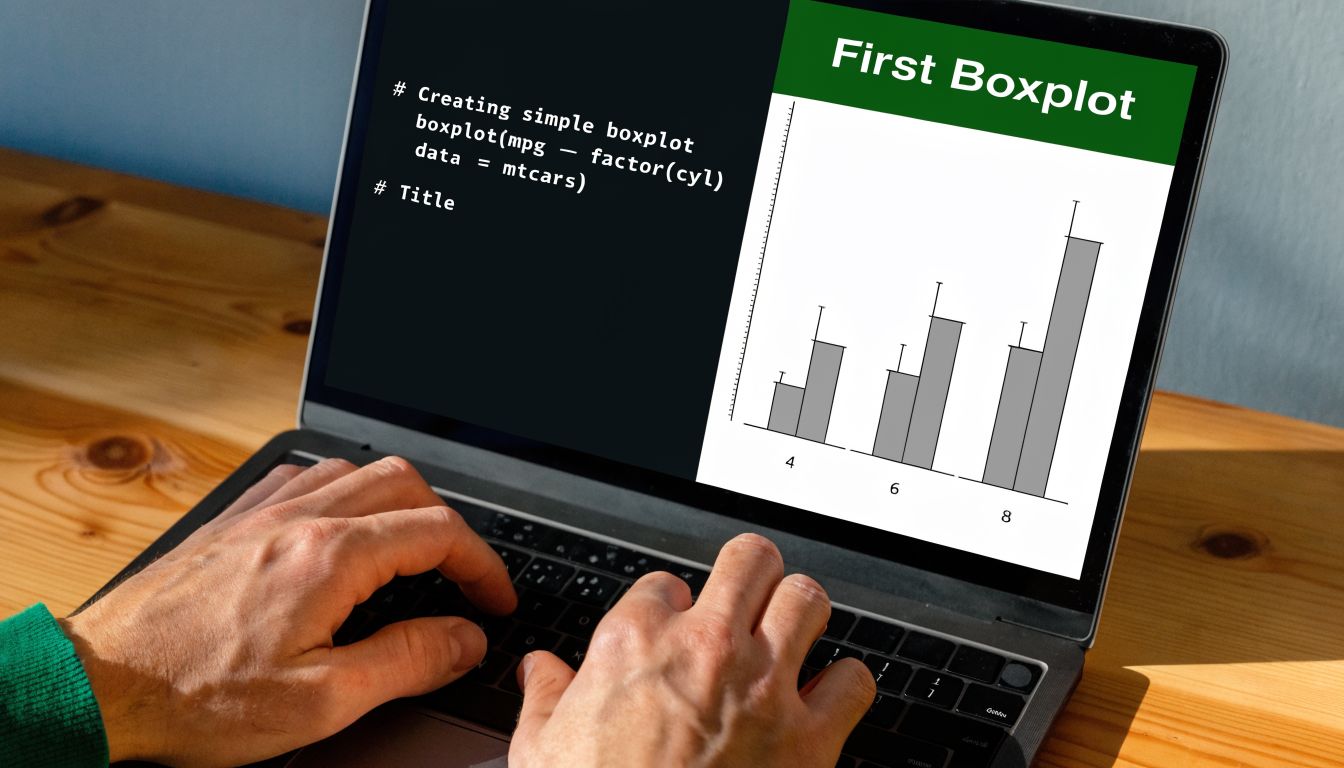
boxplot(iris$Sepal.Length)
That one line draws the distribution of Sepal.Length. When the plot appears, pause for a moment. Check where the median sits, whether the box looks compact or stretched, and whether any points sit beyond the whiskers. Those are the first clues about consistency and possible outliers.
Labels make the chart easier to read later, especially if you save several plots during exploratory analysis:
boxplot(
  iris$Sepal.Length,
  main = "Sepal Length Distribution",
  ylab = "Sepal Length",
  col = "lightblue"
)
This small step matters. A chart with a clear title and axis label is easier to revisit when you are comparing variables side by side or sharing results with a teammate.
If you want more examples of simple chart setup in R, this guide to data visualization in R is a useful companion.
Comparing groups gives you a more useful answer
A single boxplot helps you inspect one feature. Grouped boxplots help you make decisions.
Suppose you want to compare a numeric variable across categories. In that case, the formula form of boxplot() is one of the handiest patterns to learn early:
boxplot(weight ~ group, data = PlantGrowth)
R reads this as “plot weight for each group.” The categories go on the x-axis, and the numeric values go on the y-axis. Once this clicks, you can reuse the same pattern across many datasets.
Here is a cleaner version:
boxplot(
  weight ~ group,
  data = PlantGrowth,
  main = "Plant Weight by Group",
  xlab = "Group",
  ylab = "Weight",
  col = c("grey80", "grey70", "grey60")
)
Now the chart starts doing real analytical work. You can scan the groups and ask practical questions. Which category has the highest typical value? Which one shows more spread? Which one has unusual points that might deserve review before you fit a model or compare treatment effects?
That is the significant payoff for beginners. A grouped boxplot turns “I have categories and numbers” into “I can already see which groups differ and where I should investigate next.”
A common gotcha with group order
One thing often surprises new R users. The group order on the x-axis may not match the order you expect.
Base R often uses the order of factor levels, and if those levels are not set the way you want, the plot can feel awkward or misleading. The fix is simple:
PlantGrowth$group <- factor(
  PlantGrowth$group,
  levels = c("trt1", "trt2", "ctrl")
)

boxplot(weight ~ group, data = PlantGrowth)
This changes the display order without changing the underlying values. That sounds minor, but it affects how easily someone can read the comparison. Good plots reduce mental effort. If the groups appear in a confusing sequence, readers spend attention decoding the layout instead of interpreting the result.
Small customizations that improve readability
Base R defaults are plain, but plain does not mean useless. A few arguments can make the chart much easier to read without adding much code.
boxplot(
  weight ~ group,
  data = PlantGrowth,
  col = c("grey70", "grey70", "grey40"),
  names = c("Treatment 1", "Treatment 2", "Control"),
  outpch = 20,
  boxwex = 0.6,
  main = "PlantGrowth Boxplot",
  ylab = "Weight"
)
Here is what each change does:
colfills the boxes with color so groups are easier to distinguish.namesreplaces short labels with labels that read more clearly.outpchchanges the symbol used for outlier points.boxwexadjusts box width, which can improve spacing and readability.
These are presentation changes, but they also support analysis. Clear labels reduce mistakes. Visible outlier markers make follow-up checks easier. Better spacing helps you compare groups faster.
If you prefer to watch a live walkthrough before trying the code yourself, this quick video helps connect the syntax to the chart you see on screen:
What to check after you run the code
Do not stop at “the plot worked.”
Use the chart to answer a few direct questions:
- Which group has the highest median?
- Which group has the widest middle spread?
- Are there points outside the whiskers that need review?
- Does any group look uneven or more variable than the others?
That habit is what turns a boxplot from a chart into a decision tool. You are not just drawing distributions. You are checking data quality, comparing features, and spotting patterns that can shape the next step of your analysis.
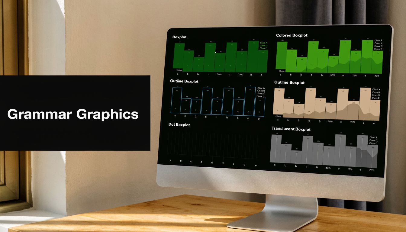
Level Up Your Visuals with ggplot2
You built a boxplot in base R. It works, and that is a good start. Then a common next step shows up fast. You want cleaner labels, a better theme, maybe the raw points on top, and you do not want to rebuild the whole plot each time you make one small change.
That is the moment ggplot2 starts to feel useful.
ggplot2 works like stacking transparent layers on a sheet. One layer defines the data. Another draws the boxes. Another can add points, labels, or summary markers. For beginners, that structure matters because it makes the chart easier to improve without turning the code into a long list of options inside one function call.
If you want a broader introduction to this plotting style, this guide to data visualization in R pairs well with the boxplot examples here.
Rebuilding the same idea in ggplot2
We will use the same PlantGrowth data so the only new thing is the plotting system:
library(ggplot2)

ggplot(PlantGrowth, aes(x = group, y = weight)) +
  geom_boxplot()
This chart answers the same basic question as the base R version. How do the groups compare in center and spread?
The code is organized differently, though. ggplot() sets up the data and tells R which variables go on each axis. geom_boxplot() adds the visual layer that turns those variables into boxes and whiskers. That separation is the reason ggplot2 becomes easier to scale once your charts get more detailed.
Add the raw points so the summary does not hide the data
A boxplot is a summary of a group, not a full picture of every observation. If your groups are small, two boxes can look similar even when the underlying values behave differently. Adding jittered points helps you check that.
ggplot(PlantGrowth, aes(x = group, y = weight)) +
  geom_boxplot(fill = "pink") +
  geom_jitter(width = 0.1, alpha = 0.7)
geom_jitter() spreads points slightly left and right so they do not sit directly on top of each other. The result is easier to read than a stack of overlapping dots.
This is more than a cosmetic upgrade. It helps with the practical side of analysis. You can see whether values are tightly packed, whether one group has several unusual observations, or whether a group has clusters that the box alone does not make obvious. That is useful when you are comparing features or deciding which variables may need extra cleaning before modeling.
A simple rule helps here. Use the boxplot to summarize the group, and use the points to check whether that summary is hiding something important.
Add a mean to compare average versus median
Sometimes you want to compare two different ideas of the center. The median is the line inside the box. The mean is the arithmetic average. Putting both on the same plot gives you a quick check for skew or the influence of extreme values.
ggplot(PlantGrowth, aes(x = group, y = weight)) +
  geom_boxplot(fill = "lightgreen") +
  stat_summary(fun = mean, geom = "point", color = "red", size = 3)
The red point marks the mean. If that point sits close to the median line, the group is fairly balanced around the center. If it sits noticeably higher or lower, that is a clue to inspect the distribution more closely.
For a beginner, the "so what?" is simple. A gap between mean and median can signal that a few large or small values are pulling the average around. In feature review, that can tell you which variables deserve extra attention before you compare groups or fit a model.
Clean up the layout for reports and presentations
Once the basic chart is working, small layout changes can make it much easier to read.
If category labels are long, flipping the axes often helps:
ggplot(PlantGrowth, aes(x = group, y = weight)) +
  geom_boxplot(fill = "pink") +
  coord_flip() +
  theme_classic()
coord_flip() rotates the plot so the group names read horizontally. theme_classic() removes some of the default background elements, which gives the chart a cleaner look.
You can also add clearer labels and color the groups directly:
ggplot(PlantGrowth, aes(x = group, y = weight, fill = group)) +
  geom_boxplot() +
  theme_classic() +
  labs(
    title = "Plant Weight by Experimental Group",
    x = "Group",
    y = "Weight"
  )
These changes seem small, but they reduce friction for the person reading your chart. In practice, that means faster comparisons and fewer mistakes when someone scans the plot in a notebook, report, or slide deck.
A few useful add-ons
ggplot2 is often the better choice when you need more than a quick inspection.
Some helpful extensions are:
plotly::ggplotly(p)if you want an interactive version for dashboards or notebooksggstatsplot::ggbetweenstats()if you want group comparisons with statistical annotationsgeom_jitter()when you want to show the actual observationsstat_summary()when you want to overlay the mean or another summary value
The pattern is the key lesson. Start with a plain boxplot. Then add only the layers that answer your question better. If you are checking outliers, show points. If you are comparing average versus median, add the mean. If labels are hard to read, flip the axes.
That is how ggplot2 helps beginners. It turns a boxplot from a basic chart into a tool you can adapt to the exact decision in front of you.
Interpreting Your Boxplot and Common Pitfalls
Making the chart is the easy part. Reading it well is what saves you from weak conclusions.
A boxplot in r is most useful when you ask a business or modeling question while you look at it. Which group looks most stable? Which feature might need scaling or transformation? Are the odd points errors, or are they the whole reason the analysis is interesting?
Read the plot like a short story
Start with the median. That line tells you where the center of each group sits. If one group’s median is clearly higher, that group tends to have larger values.
Then look at the box height. A taller box means the middle half of the data is more spread out. It does not mean there are more observations.
Then check the whiskers and outliers. Long whiskers suggest values stretch farther on one or both sides. Points outside the whiskers deserve attention, but not automatic deletion.
A useful checklist is:
- Center: Which median is highest or lowest?
- Spread: Which group has the largest IQR?
- Shape hint: Does one side look more stretched?
- Outliers: Which values sit outside the default fence?
Outliers are signals, not automatic mistakes
One of the most common beginner errors is treating every outlier as bad data. Sometimes it is a data entry problem. Sometimes it’s a rare but real event. Sometimes it’s the exact case your team needs to investigate.
The practical move is to extract those values and inspect them. A frequently asked question is how to do this programmatically, and one direct approach is:
outliers <- boxplot(df$y, plot = FALSE)$out
That lets you capture the values R flagged as outliers for filtering or follow-up analysis (YouTube discussion on boxplot outlier handling). If you want another diagnostic view for unusual distribution shape, a normal Q-Q plot in R pairs nicely with a boxplot because it helps you check whether the data departs from a more symmetric pattern.
Don’t delete an outlier just because the chart drew a dot. Check the row, the context, and the business meaning first.
Common mistakes that lead to bad reads
Here are the ones I see most often:
- Assuming wider means more rows: Box size reflects spread, not sample count.
- Ignoring category order: Alphabetical order can create a confusing comparison.
- Using only the boxplot: With small datasets, overlaying raw points often gives needed context.
- Confusing mean and median: The boxplot’s center line is the median, not the average.
- Over-trusting the default rule: The 1.5 × IQR rule is useful, but not magical.
When the plot looks “off”
Sometimes a boxplot feels odd because the data is strongly skewed or has multiple clusters. In that case, the chart is still doing something useful. It’s telling you the default summary may be hiding complexity.
That’s your cue to inspect the underlying values, add jittered points, or use another complementary plot. A good analyst doesn’t ask one chart to answer every question.
Advanced Customization and Exporting Your Plot
Once you’re comfortable reading a boxplot, the next step is making it work better for your audience. That usually means two things. First, clarify the plot. Second, save it in a format that won’t fall apart when you drop it into a report or slide deck.
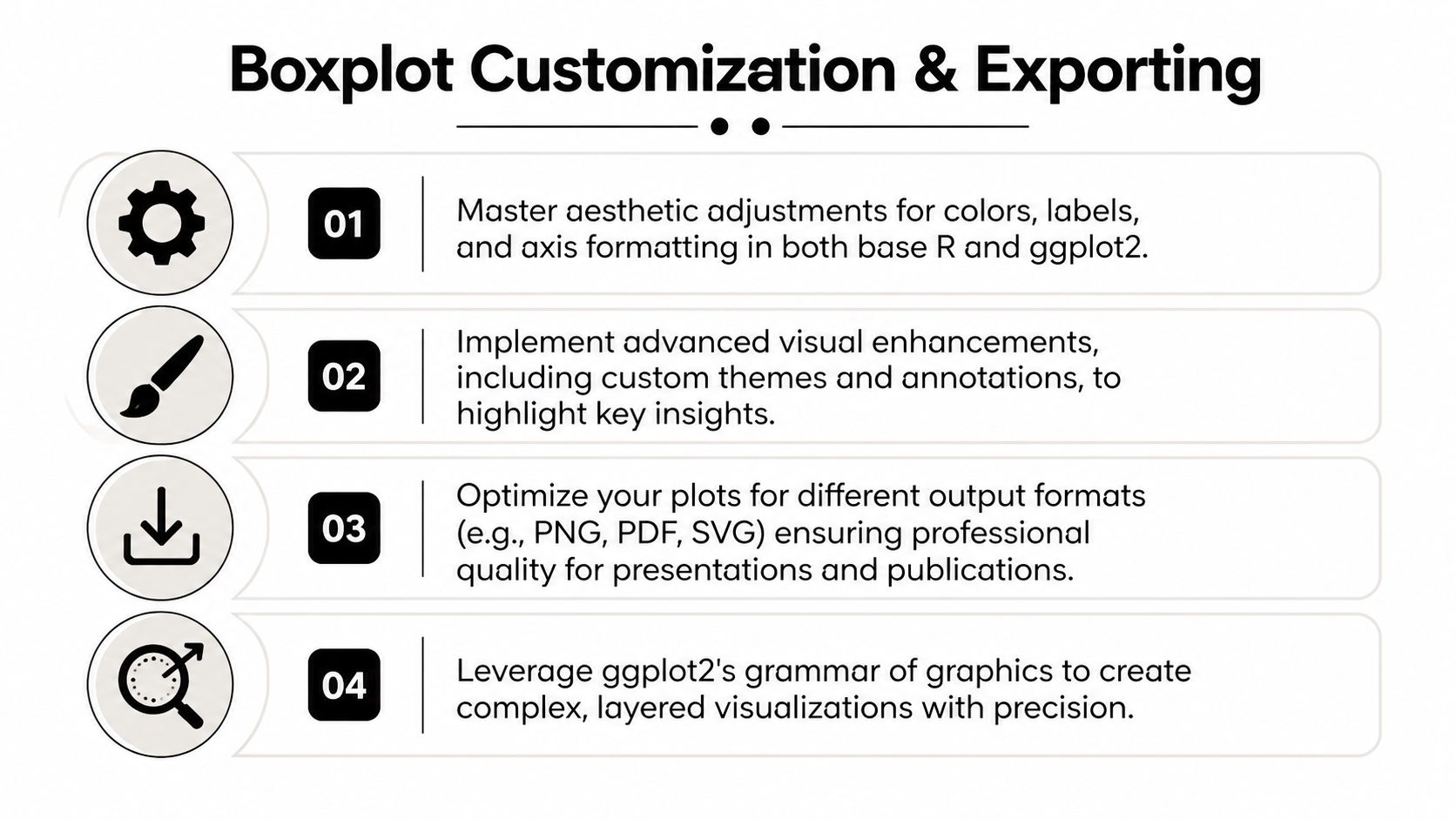
Small upgrades that add meaning
In base R, you can add notches with notch = TRUE if you want a rough visual cue around medians. In ggplot2, you can improve readability with cleaner themes, flipped coordinates, and annotations.
A few useful ideas:
- Add sample labels: If you know the count per group, adding
n = ...near each box helps readers judge the summary in context. - Rename categories: Clear labels beat cryptic group codes.
- Control colors carefully: Use color to support grouping, not to decorate.
- Annotate special points: If an outlier matters, label it directly instead of hoping the reader notices.
Standard boxplots have limits on skewed data
Expert judgment is important in this context. Standard boxplots can perform poorly on skewed data, which is common in AI-related measurements like inference time or latency. A more effective option is a skewness-adjusted boxplot using packages such as ggskewboxplots, which integrates with ggplot2 through geom_skewboxplot() (arXiv paper on skewness-adjusted boxplots).
That doesn’t mean the regular boxplot is useless. It means you should be cautious when the distribution is clearly asymmetric. If the data has a long tail, the standard fences may not tell the whole story.
Expert view: If your metric is heavily skewed, treat the default boxplot as a first draft, not the final verdict.
Save your plot so it stays sharp
For ggplot2, the usual tool is ggsave():
p <- ggplot(PlantGrowth, aes(x = group, y = weight)) +
  geom_boxplot(fill = "skyblue") +
  theme_classic()

ggsave("plantgrowth-boxplot.png", plot = p, width = 8, height = 5)
ggsave("plantgrowth-boxplot.pdf", plot = p, width = 8, height = 5)
For base R, open a graphics device, draw the plot, then close it:
png("base-boxplot.png", width = 800, height = 500)
boxplot(weight ~ group, data = PlantGrowth, col = "grey80")
dev.off()
Use PNG when you need a simple image for slides or documents. Use PDF when you want crisp output that scales well for print or sharing.
A good export habit is to save the final plot right after you create it, while the code and context are still fresh. That saves you from recreating a chart later and wondering which version was the “real” one.
If you’re learning R for analytics, AI projects, or business reporting, YourAI2Day is a useful place to keep building your toolkit. It brings together practical guides, AI-focused explainers, and approachable technical content that can help you go from “I can make the chart” to “I know what the chart means and what to do next.”