
Mastering Data Visualization Techniques for Clear Insights
Data visualization is all about translating raw numbers and tangled information into something visual—like charts and maps. Think of it as turning a dense spreadsheet into a story you can grasp in an instant. It makes spotting trends, weird outliers, and hidden patterns almost effortless. For anyone who works with data, especially in the AI world, this skill is absolutely essential.
Why Data Visualization Is Your Secret Superpower

Ever feel like you're drowning in a sea of spreadsheets? You're not alone. Raw data, by itself, is just a jumble of disconnected notes. Data visualization is the conductor that arranges those notes into a symphony, revealing the melody hidden in the numbers.
This knack for telling visual stories helps us make smarter decisions, faster. A well-designed chart can deliver a key insight in seconds, saving you hours of trying to decipher rows and columns of raw figures. This is especially true in business and AI, where getting a handle on complex systems is the name of the game.
Turning Numbers Into Narratives
At its heart, every visualization technique is a communication tool. It’s about taking something abstract, like sales figures or user engagement metrics, and making it tangible and easy to relate to. This is where the real understanding happens.
For instance, you could tell your team, "Q3 sales jumped 18%." Or, you could show them a line chart with a sharp upward curve that makes that growth feel real and exciting. Truly understanding your data means getting these fundamentals right, a point driven home by this great piece on the power of financial data visualization.
Expert Opinion: “The best data visualization isn't the fanciest one. It's the one that gives your audience an 'aha!' moment without you having to say a word," explains data strategist Maria Petrova. "Your goal is to make the data speak for itself."
The Growing Importance In An AI-Driven World
The demand for these skills is exploding, largely because businesses need real-time insights from colossal datasets. The global data visualization market was valued at USD 4.8 billion in 2024 and is expected to hit USD 12.3 billion by 2033—a clear sign of how vital visuals have become.
AI and machine learning are pouring fuel on this fire, automating complex analyses that help people finally make sense of big data. You can dig into these trends in this detailed market analysis.
As we get into the nuts and bolts of specific techniques, just keep one thing in mind: clarity is king. Every chart and graph is a tool designed to turn data into a story that informs, persuades, and drives action.
Your Foundational Visualization Toolkit
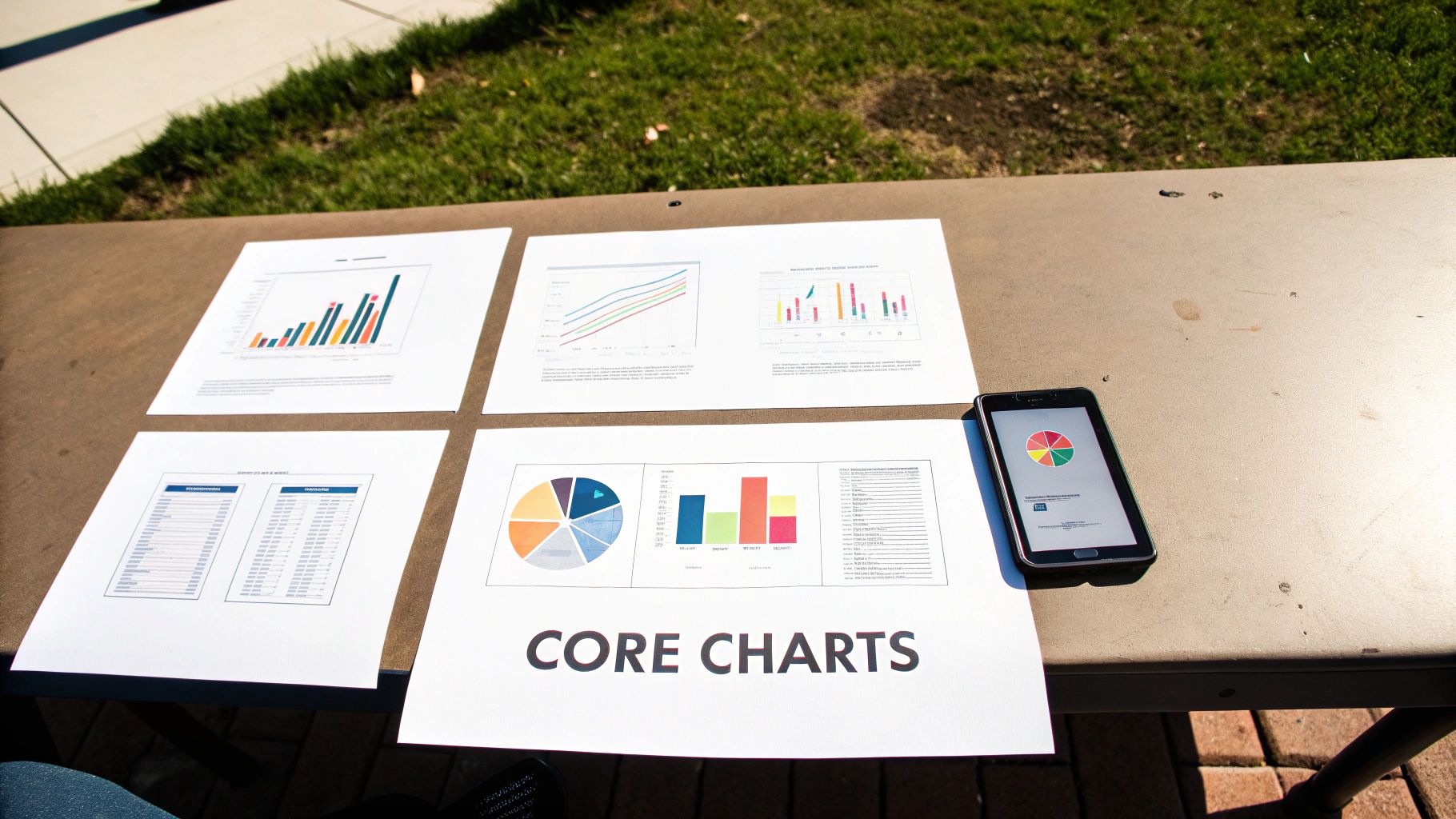
Before you can get anywhere with complex AI models, you first have to get a handle on the data that fuels them. This is exactly where the classic data visualization techniques come in. Think of them as the essential tools in your workshop—they're reliable, versatile, and the absolute best way to get a quick, clear picture of what your numbers are really trying to tell you.
Let’s start with the basics everyone needs to master. I'm going to skip the textbook definitions and jump straight into the "when" and "why" for each chart, using real-world examples to make it all click. By the end, you'll have a solid gut feeling for which visual tells the right story.
Bar Charts For Clear-Cut Comparisons
When you need to compare things, the bar chart is the undisputed champion. It’s brilliant at showing the relationship between a category (like product types or marketing channels) and a number (like sales figures or user counts). The length of each bar makes it incredibly easy for our brains to see which category is bigger or smaller at a glance.
Imagine you're analyzing customer acquisition for a new AI-powered app. A bar chart is the perfect way to show which channel—say, Organic Search, Social Media, or Paid Ads—brought in the most new users last quarter. The visual gap between the bars tells the story instantly.
Expert Opinion: Cole Nussbaumer Knaflic, a leader in data storytelling, always says you should start with a personal hook to get an audience invested. Your chart should do the same by answering a simple, relevant question like, "Which of our products is selling the best?"
You can orient them vertically (column charts) or flip them horizontally. Horizontal bars are a lifesaver when you have long category names that would otherwise get squished and become impossible to read.
Line Charts For Tracking Trends Over Time
If your story is about change, the line chart is your best friend. Nothing beats it for showing how a value evolves over a period of time, whether that's days, months, or years. The slopes of the line immediately reveal trends, seasonal patterns, and sudden spikes or dips.
For instance, if you're tracking the accuracy of a machine learning model over 30 days of training, a line chart would perfectly illustrate its learning curve. You could see in a second if the model's performance is steadily improving, hitting a wall, or even getting worse. This makes line charts absolutely essential for monitoring performance metrics.
Scatter Plots For Uncovering Hidden Relationships
Ready to play data detective? Scatter plots are your go-to for revealing the relationship—or lack thereof—between two different numerical variables. Every single dot on the plot is a data point, placed according to its values on the horizontal and vertical axes.
Here’s a classic use case for an AI pro: you could plot the "size of a dataset" on one axis and "model training time" on the other. A scatter plot would likely show a clear positive correlation, where bigger datasets mean longer training times. Spotting these kinds of connections is a crucial first step in building predictive models.
Pie Charts For Showing Parts of a Whole
Pie charts get a bad rap, and sometimes for good reason. But they have one specific, powerful use: showing proportions. When you need to illustrate how different segments contribute to a total, a pie chart can be quite effective, but only if you follow a few simple rules.
Here’s how to do it right:
- Keep it simple: Never use more than five or six slices. Any more than that, and it becomes a cluttered, unreadable mess.
- Make sure it adds up: The slices must represent a complete set that equals 100%.
- Order the slices logically: Start the biggest slice at the 12 o'clock position, then arrange the rest clockwise in descending order.
A pie chart could, for example, effectively show the market share of different AI software companies, with each slice clearly representing one company's piece of the total market.
These core charts are the building blocks you'll use to create more advanced and nuanced visualizations. Get comfortable with them, and you'll have a rock-solid foundation for any data analysis you tackle. If you're curious about the tools used to create these visuals, check out our guide on essential Python libraries for data analysis that help bring these charts to life.
Peeling Back the Layers with Advanced Visualization
Once you’ve mastered the fundamentals, it's time to dig deeper. Some stories in your data are too complex for a simple bar or line chart to tell. That’s where more advanced techniques come in, acting like specialized tools that reveal patterns hiding just beneath the surface.
These aren't just flashy graphics; they're powerful analytical instruments. Each one is designed to untangle a specific kind of complexity, whether it's understanding intensity, navigating hierarchies, or mapping out relationships. Let's explore a few of the most effective ones.
Seeing Intensity with Heatmaps
Ever needed to see the "hotspots" in your data? A heatmap does exactly that. It uses color gradients to show the concentration or intensity of a value across two dimensions, making it incredibly intuitive to spot where the action is.
Think of tracking website clicks. A heatmap can instantly show you which parts of a webpage get the most attention, using fiery reds for popular areas and cool blues for ignored ones. Or, you could map out server load by hour and day of the week, immediately identifying your peak traffic times without having to look at a single number.
Untangling Hierarchies with Treemaps
When you're dealing with data that has a nested structure—like a company's budget broken down by department, then by project, then by individual expense—things can get messy. A treemap cuts through that complexity. It displays hierarchical data as a set of nested rectangles.
The size of each rectangle represents a value, like its share of the total budget. This gives you a bird's-eye view of how all the smaller pieces contribute to the whole. You can see at a glance that the "Engineering" department takes up the biggest chunk of the budget and that "Server Costs" is its largest sub-category.
Expert Opinion: “The real power of a great visualization is its ability to make the complex feel simple. Advanced charts like treemaps excel at turning a complicated hierarchy into a single, easy-to-read picture,” notes visualization expert, Dr. Alan Jensen.
Mapping Connections with Network Graphs
So much of our world is about relationships—how people, ideas, or systems connect. A network graph (also called a node-link diagram) is designed specifically to visualize these connections. It uses nodes (dots) to represent entities and links (lines) to show the relationships between them.
You could use a network graph to map friendships in a social network, revealing influential users who act as community hubs. In a business context, you might visualize communication patterns between employees to see which teams are well-integrated and which are operating in silos. You can explore how machine learning powers data analytics to uncover exactly these kinds of hidden connections.
Putting Data in Its Place with Geospatial Visualization
Sometimes, the where is the most critical part of the story. Geospatial visualization overlays your data on a map, which can instantly reveal geographic trends, clusters, and outliers that you’d never spot in a spreadsheet.
This could be as simple as coloring a map to show sales performance by state or as complex as plotting the real-time spread of a disease. By grounding your data in a physical location, you add a powerful layer of context that makes the information more relevant and actionable. For example, a retail company could map customer addresses to find the optimal location for a new store.
These advanced tools are quickly becoming essential. The demand for sophisticated visualization software is surging, with the market expected to reach USD 19.20 billion by 2027. This isn't just a trend; it's a fundamental shift in how organizations make decisions, especially in data-heavy fields like IT and research. You can read more about this market growth to understand the forces at play. By adding these techniques to your skillset, you're equipping yourself to find and share the deeper, more powerful stories your data has to tell.
How to Choose the Right Chart for Your Story
Knowing all the different visualization techniques is one thing; picking the perfect one for your specific data is a completely different skill. The most powerful visuals don't just happen—they start with a crystal-clear purpose. Before you even touch a charting tool, you need to answer two fundamental questions.
First, what story am I trying to tell? Are you trying to highlight a stark comparison between products? Show a clear trend over time? Uncover a hidden relationship between two seemingly unrelated metrics? Your primary goal is your compass, and it will immediately point you in the right direction.
Second, who is my audience? A dashboard for seasoned data analysts can be dense and complex, but a slide deck for the executive team needs to be instantly digestible. The best chart is always the one your audience gets in under 10 seconds, not the one that looks the most technically impressive.
Aligning Your Goal with Your Visual
Matching your objective to the right chart type is the most critical step. If you get this wrong, you risk confusing your audience or, worse, leading them to a completely incorrect conclusion. It's like picking a tool for a job—you wouldn't bring a sledgehammer to hang a picture frame.
Here's a quick cheat sheet for making that choice:
- To Compare Values: If you need to show how different categories perform against one another, a bar chart is your go-to. For tracking those comparisons over a period of time, nothing beats a classic line chart.
- To Show Relationships: When you're investigating whether two variables move together, a scatter plot is the perfect way to spot correlations, clusters, and outliers at a glance.
- To Illustrate Composition: Trying to show how individual parts make up a whole? A pie chart can work, but only if you follow the golden rule: six slices or fewer. Anything more becomes a cluttered mess. A treemap is often a better alternative for more complex compositions.
- To Understand Distribution: To see how your data is spread out, a histogram or a box plot is invaluable. They quickly reveal the range, central tendencies, and any unusual data points that might need a closer look.
This thought process guides you toward the right chart, whether it's a foundational one or something more advanced. This simple decision tree, for example, shows how your data's characteristics can lead you to the perfect advanced visualization.
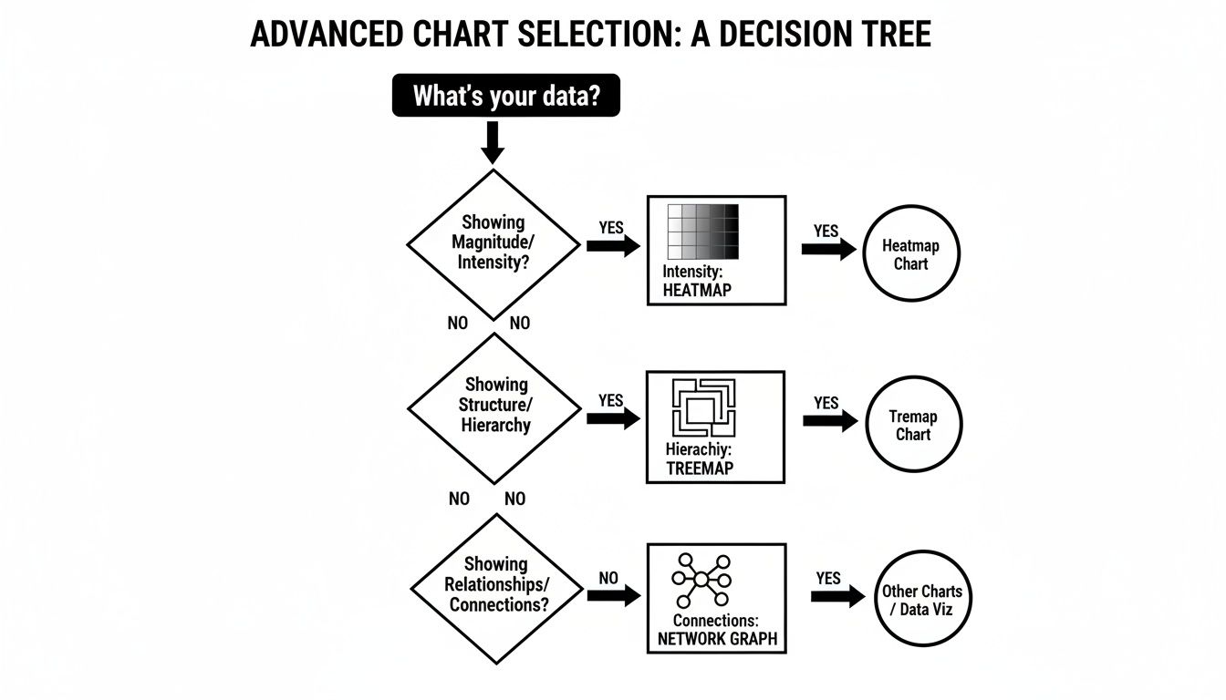
As the graphic shows, the very nature of your data—whether you're dealing with intensity, hierarchy, or connections—points you directly to the best chart for the job.
Which Chart Should I Use? A Practical Comparison
To make this even simpler, here's a table that breaks down common goals and connects them to the most effective visualization techniques. Think of it as a quick reference guide to keep in your back pocket.
| Your Goal | Recommended Technique(s) | When To Use It |
|---|---|---|
| Compare categories | Bar Chart, Column Chart | You have distinct categories (e.g., products, regions) and want to see which is bigger or smaller. |
| Track changes over time | Line Chart, Area Chart | You have a continuous dataset over a time period (e.g., monthly sales, daily website traffic). |
| Show relationships | Scatter Plot, Bubble Chart | You want to see if two or more variables are correlated (e.g., marketing spend vs. revenue). |
| Illustrate parts of a whole | Pie Chart, Treemap, Stacked Bar | You need to show composition, like market share or budget allocation. |
| Analyze data distribution | Histogram, Box Plot | Your goal is to understand the spread, central tendency, and outliers in a dataset. |
| Visualize geospatial data | Choropleth Map, Point Map | Your data is tied to specific geographic locations (e.g., sales by state, customer density). |
This table isn't exhaustive, but it covers the vast majority of scenarios you'll encounter. Always start by identifying your primary goal, and you'll find the path to the right chart becomes much clearer.
The Golden Rule of Clarity
It’s tempting to get swept up in creating a visually stunning chart that uses a cool, new technique. But remember: complexity is often the enemy of understanding. I'll never forget a piece of advice a senior data scientist gave me years ago.
"The best chart isn’t the most complex one; it’s the one your audience understands instantly. If you have to spend five minutes explaining what the chart means, you’ve already lost."
This principle is all about putting clarity above all else. A simple, well-labeled bar chart that delivers an immediate insight is infinitely more valuable than a beautiful but baffling network graph. Your job is to communicate, not to decorate. Always default to the simplest visualization that can effectively tell your story.
This focus on clear communication is a constant theme among experts. To truly nail this, I highly recommend digging into a comprehensive guide to choosing the right charts that explores these concepts more deeply. At the end of a day, your success isn't measured by the sophistication of your tools, but by the "aha!" moment you create for your audience.
AI's Role in Modern Data Visualization

We’ve covered a lot of ground, from the foundational charts to more complex graphs. But what happens when you introduce artificial intelligence into the mix? It fundamentally changes the game, shifting visualization from a manual task to a dynamic, intelligent partnership.
Imagine this: instead of spending hours cycling through different charts to see what sticks, you have an AI assistant that does the heavy lifting. It scans your dataset, understands the underlying relationships, and recommends the most effective way to tell your data’s story. This isn't a far-off concept; it’s a core feature in many modern analytics platforms.
This shift is accelerating decision-making everywhere. The global data visualization market, valued at USD 9.84 billion in 2025, is expected to maintain a 10.95% annual growth rate through 2033. This growth is largely driven by AI's ability to pull clear, fast insights out of incredibly complex data. You can explore the full market projections on Data Insights Market for a deeper look.
Peeking Inside the "Black Box" of AI
One of the long-standing challenges with machine learning is its "black box" problem. An AI model can deliver a stunningly accurate prediction, but it's often impossible to know how it got there. This is where specialized data visualization techniques become indispensable for data scientists and developers.
Visualizing a model's internal logic helps build trust, making it easier to debug and refine its performance. It’s like opening the hood to see how the engine actually works.
Here are a few key visualization methods used to demystify AI:
- Neural Network Visualization: This maps out the layers and neurons in a deep learning model. You can literally see which parts of the network "light up" when it processes certain data, like identifying a specific object in a picture.
- Feature Importance Plots: These are straightforward but incredibly useful bar charts. They rank which data features a model leans on most heavily to make its decisions—for example, showing that "credit score" is a much bigger factor than "age" for a loan approval model.
- Confusion Matrices: A specialized heatmap designed to evaluate how well a classification model is performing. It clearly shows where the model is correct and where it's getting confused (like mistaking a picture of a muffin for a chihuahua).
Making Sense of High-Dimensional Data
Many AI models operate on data with hundreds or even thousands of dimensions—far more than the human brain can process. So, how do you visualize something you can't even conceptualize? This is where dimensionality reduction techniques, like the popular t-SNE, come in.
Expert Opinion from an AI Developer: "We use t-SNE plots constantly. They take this impossibly complex, high-dimensional space and flatten it into a 2D map we can actually look at. It lets us see natural clusters and relationships in the data that would be completely invisible otherwise. It's our go-to for a first look at any new, complex dataset."
Think of a t-SNE (t-Distributed Stochastic Neighbor Embedding) plot as a smart scatter plot. It takes all your data points, figures out which ones are similar, and groups them together in a 2D view while pushing dissimilar points apart. A t-SNE plot of customer data, for instance, could instantly reveal distinct user groups you never knew existed.
AI is no longer just a subject for visualization; it's become an active partner in visualization. This blend of intelligent automation and human-centric design is pushing the boundaries of what we can learn from data, making powerful insights more accessible than ever.
Where to Go From Here
We've covered a lot of ground, from the workhorse charts that form the backbone of any analysis to the more advanced visuals that can tease out hidden patterns in complex data. We've even peeked into how AI is shaping the future of visualization. But knowing the map is one thing; taking the journey is another.
If there's one thing you should take away from all this, it's that data visualization is less about memorizing a rigid set of rules and more about developing an instinct for storytelling. It’s the art of looking at a spreadsheet full of numbers and seeing a narrative waiting to be told. Every chart you build is an opportunity to communicate an idea, persuade an audience, or inspire action.
Getting Hands-On with the Right Tools
The best way to get good at this is to simply start doing it. Luckily, you don't need to be a coding wizard to create stunning, insightful visuals. There are some fantastic tools out there that let you jump right in.
- Tableau Public: This is the free version of an industry giant. It’s an incredibly powerful platform with a massive, supportive community, making it a perfect place to start experimenting.
- Looker Studio (formerly Google Data Studio): A super intuitive, web-based tool that plays nicely with Google Sheets and Analytics. It's one of the fastest ways to go from raw data to a live, interactive dashboard.
For Those Ready to Code
If you're comfortable with programming (or want to be), a code-first approach offers unparalleled power and flexibility. For data professionals, Python is the go-to language, and its visualization libraries are phenomenal.
Expert Opinion: “Crafting a visualization with code is a data scientist's superpower,” says lead data scientist Dr. Eva Chen. “It gives you absolute control over every pixel and, just as importantly, makes your entire analysis repeatable—the gold standard for reliable work.”
To head down this path, you'll want to get familiar with these two libraries:
- Matplotlib: The granddaddy of all Python plotting libraries. It can be a bit verbose, but it gives you fine-grained control over every single element of your chart.
- Seaborn: This is built right on top of Matplotlib and makes creating beautiful, common statistical plots much, much easier. Think of it as a friendlier interface for 90% of what you’ll need to do.
Your journey is just starting. The next step is simple: pick a tool, find a dataset you're curious about, and start asking it questions. The more you practice these data visualization techniques, the better you'll get at making your data speak.
Frequently Asked Questions About Data Visualization
Even after covering the basics and diving into advanced techniques, you probably still have a few questions rolling around. That’s completely normal. Getting comfortable with all this takes time, so I’ve put together some quick, straightforward answers to the questions I hear most often.
Think of this as your go-to cheat sheet to help lock in what you've learned.
What Makes a Data Visualization Effective?
An effective visualization nails one thing above all else: it communicates a clear message, fast. It’s not about flashy graphics or cramming in every color of the rainbow.
A truly great visual is:
- Clear: The main takeaway should be obvious within seconds. No lengthy explanation needed.
- Accurate: It has to represent the data faithfully, without twisting the facts.
- Efficient: It packs a lot of information into a compact space without looking like a chaotic mess.
- Relevant: It directly addresses the question at hand for the people you're showing it to.
In the end, if your audience has that "aha!" moment and grasps the insight you're trying to share, you've done your job.
How Is Data Visualization Different from Data Analytics?
This is a fantastic question because the two are deeply connected but definitely not the same thing. I like to think of it like a detective cracking a case.
Data analytics is the whole investigation. It’s gathering the clues (the data), dusting them for prints (cleaning them up), looking at them from every possible angle, and finally, figuring out "whodunnit" (drawing conclusions).
Data visualization, on the other hand, is the detective’s evidence board. It’s where they pin up photos, notes, and maps, then connect them with string to see the hidden patterns. It’s the tool that helps them—and everyone else in the room—make sense of the evidence. Analytics is the process of finding the story; visualization is the art of telling it.
An expert explains: "As a data scientist, I see it this way: Analytics finds the story, but visualization tells it. One without the other is only half the picture. Effective data governance is what ensures the story is based on reliable facts."
Can a Visualization Be Misleading?
Absolutely. It happens more often than you'd think, sometimes on purpose and sometimes completely by accident. One of the most common slip-ups is messing with the Y-axis on a bar chart. If you don't start the axis at zero, you can easily make tiny differences look like massive, dramatic shifts.
Another classic mistake is a pie chart with way too many slices, which makes it impossible for anyone to compare the pieces accurately. Being a responsible data storyteller means you have to present your findings with honesty. To pull this off, you have to understand the rules that govern your data. You can learn more about this in our guide to data governance best practices. Always choose clarity and integrity over a cheap, sensationalist graphic.
At YourAI2Day, our mission is to make the world of AI and data easier to understand. Keep exploring our resources to build your skills and stay on top of your game. https://www.yourai2day.com