
How to Draw a Scatter Plot in R: A Beginner’s Guide
You’ve probably got a dataset open right now and a simple question in your head. Do these two variables move together, or not?
Maybe it’s customer age and spend, model confidence and error, ad impressions and clicks, or sensor temperature and failure rate. The spreadsheet gives you rows and rows of values, but your eyes can’t reliably spot a pattern from raw numbers alone. That’s where a scatter plot earns its keep.
If you’re learning how to draw a scatter plot in R, the good news is that R gives you two strong paths. Base R is fast and direct. ggplot2 is more expressive and easier to scale into polished visual work. Both matter, and both help you ask better questions of your data.
Why Scatter Plots Are Your Best Friend in Data Analysis
A scatter plot is one of the simplest charts you can make, but it’s also one of the most useful. Each point represents one observation. Its horizontal position comes from one variable, and its vertical position comes from another. That’s it.
That simple setup answers a surprisingly rich set of questions. Do larger values of x tend to come with larger values of y? Do the points split into groups? Are there outliers that deserve a second look? Before you fit a model, tune a pipeline, or write a recommendation, this is often the fastest way to see what’s really going on.
Why this matters early in a project
Think about a beginner building an AI workflow for customer behavior. They may suspect that product price affects conversion, or that time-on-site relates to purchase size. If they jump straight into modeling, they can miss basic issues like clusters, weird points, or a relationship that bends instead of running in a straight line.
A scatter plot is your first conversation with the data. It doesn’t give a final answer. It helps you ask a better next question.
A good scatter plot doesn’t just decorate analysis. It exposes assumptions before those assumptions turn into bad decisions.
You’ll also see scatter plots all over exploratory work because they’re flexible. They work for business data, scientific measurements, model diagnostics, and feature inspection. If you want a broader view of chart choices beyond scatter plots, this guide to data visualization in R is a useful companion.
What a scatter plot helps you notice
- Direction: Are points drifting upward, downward, or nowhere obvious?
- Strength: Is the relationship tight, loose, or noisy?
- Shape: Is it roughly linear, curved, or broken into segments?
- Groups: Do categories form separate clouds of points?
- Outliers: Is one point pulling your attention for a reason?
That last point matters more than beginners expect. One unusual observation can completely change how a pattern feels. A plot helps you catch that before you trust a summary statistic too much.
Two ways to do the job in R
You don’t need to pick a lifelong favorite today. Use the right tool for the moment.
| Approach | Best for | Style |
|---|---|---|
| Base R | quick checks, lightweight plotting, simple scripts | minimal and direct |
| ggplot2 | layered plots, grouped data, polished output | structured and expressive |
If base R feels like sketching on a whiteboard, ggplot2 feels like assembling a chart from building blocks. Both are worth learning because real work often needs both speeds.
Your First Scatter Plot Using Base R
Base R is the fastest path from data to picture. You already have the plotting function built in, so there’s nothing extra to install for your first try.
The plot() function in base R has been the foundational command for scatter plots since R's early days, inherited from the S language of 1976. Using the built-in mtcars dataset, a simple plot(mtcars$wt, mtcars$mpg) reveals a strong negative correlation, a technique used in over 85% of introductory R tutorials to demonstrate the core concept of visualizing relationships between two numeric variables, as noted in this video reference on base R plotting.

Start with one line
Use the built-in mtcars data. It includes car weight (wt) and fuel efficiency (mpg).
plot(mtcars$wt, mtcars$mpg)
That one command draws a scatter plot. R places wt on the x-axis and mpg on the y-axis.
Here’s the story behind the chart. Each dot is one car. Dots farther right are heavier cars. Dots higher up get better fuel efficiency. When you look at the cloud of points, the general pattern slopes downward. Heavier cars tend to get lower mpg.
Make the plot readable
The default plot works, but it leaves too much interpretation to the viewer. Add labels and styling so the chart explains itself.
plot(
  mtcars$wt,
  mtcars$mpg,
  main = "Car weight vs fuel efficiency",
  xlab = "Weight (1000 lbs)",
  ylab = "Miles per gallon",
  pch = 19,
  col = "steelblue"
)
A few arguments matter a lot here:
mainadds a title so someone can understand the chart without your narration.xlabandylabreplace vague axis text with plain language.pch = 19uses solid circles, which many people prefer because the points are easier to see.colchanges the point color.
Practical rule: If a plot needs you standing beside it to explain what the axes mean, the plot isn’t finished yet.
Why pch and color matter
Beginners often treat point shape and color as decoration. They’re not. They control legibility.
Solid points can make density easier to see. A calm color can reduce visual noise. If you’re presenting to a team, these small choices make the chart easier to trust because it feels intentional instead of accidental.
You can also try different symbols:
plot(
  mtcars$wt,
  mtcars$mpg,
  pch = 17,
  col = "darkgreen",
  main = "Weight vs MPG",
  xlab = "Weight (1000 lbs)",
  ylab = "Miles per gallon"
)
A triangle (pch = 17) isn’t better by default. It’s just an example of how you can adapt the chart to your style or to a report standard.
A beginner confusion worth clearing up
A scatter plot needs two numeric variables of the same length. That means each x value must pair with one y value from the same observation.
If you’ve imported a CSV and your columns aren’t behaving as expected, fix that before plotting. This guide on importing CSV files in R can help if your data types came in wrong.
Another common issue is missing values. If one variable has missing entries, some points won’t plot cleanly. A safe pattern is:
good_rows <- complete.cases(mtcars$wt, mtcars$mpg)
plot(mtcars$wt[good_rows], mtcars$mpg[good_rows])
That keeps only complete pairs.
A slightly cleaner workflow
You may find code easier to read if you assign variables first.
x <- mtcars$wt
y <- mtcars$mpg

plot(
  x, y,
  main = "Car weight vs fuel efficiency",
  xlab = "Weight (1000 lbs)",
  ylab = "Miles per gallon",
  pch = 19,
  col = "gray52"
)
That style becomes especially helpful once your variable names get longer.
If you want to see another walkthrough before moving on, this short video gives a practical visual demo:
What you should be looking for
Don’t stop at “the plot worked.” Ask what the shape says.
- Do points slope up or down
- Are they tightly packed or spread out
- Is there a point far from the rest
- Does the pattern look straight or curved
That habit matters more than memorizing arguments. Drawing the chart is easy. Reading it is the real skill.
Creating Expressive Plots with ggplot2
At some point, base R starts to feel cramped. You want cleaner styling, easier grouping, or a plot that grows gracefully as your question gets more complex. That’s where ggplot2 helps.
The core idea is simple. You build the chart in layers. First you name the data, then you map variables to visual roles, then you add geometric objects like points or lines.
Rebuild the same idea in ggplot2
Install and load the package if needed:
install.packages("ggplot2")
library(ggplot2)
Now recreate a scatter plot with mtcars:
ggplot(mtcars, aes(x = wt, y = mpg)) +
  geom_point()
That reads almost like a sentence. Take mtcars, map wt to x and mpg to y, then draw points.
Why beginners often like ggplot2 after the first hurdle
ggplot2 can feel strange at first because it doesn’t work like a single all-in-one function. But once the pattern clicks, it becomes easier to reason about.
You separate the parts of the chart:
| Part | What it does |
|---|---|
ggplot(data, aes(...)) |
defines the dataset and mappings |
geom_point() |
tells R to draw points |
labs() |
adds labels and title |
theme_*() |
changes appearance |
That separation is useful because you can keep adding layers without rewriting the plot from scratch.
Make it more informative
Here’s a cleaner version:
ggplot(mtcars, aes(x = wt, y = mpg)) +
  geom_point(size = 2, alpha = 0.7, color = "steelblue") +
  labs(
    title = "Car weight vs fuel efficiency",
    x = "Weight (1000 lbs)",
    y = "Miles per gallon"
  ) +
  theme_minimal()
The alpha argument controls transparency. That becomes helpful when points overlap. theme_minimal() strips away some of the extra clutter and gives you a lighter visual style.
ggplot2rewards clear thinking. When you know what each layer is doing, your chart code becomes easier to debug and easier to improve.
Add a third variable with color
The power of ggplot2 becomes evident. You can map another variable to color and reveal more structure in the data.
The ggplot2 package, with 90% adoption in CRAN downloads for visualization, uses geom_point() to create scatter plots. A key technique is mapping a categorical variable to an aesthetic, like in ggplot(iris, aes(Sepal.Length, Sepal.Width, color=Species)) + geom_point(). This dynamically groups data, a feature used to create multi-group plots with confidence ellipses, a standard practice in AI/ML for visualizing cluster separation, as described in this ggplot2 scatter plot guide.
Try it with the classic iris dataset:
ggplot(iris, aes(x = Sepal.Length, y = Sepal.Width, color = Species)) +
  geom_point(size = 2, alpha = 0.7) +
  labs(
    title = "Sepal length vs sepal width",
    x = "Sepal length",
    y = "Sepal width"
  ) +
  theme_minimal()
Now the plot tells two stories at once. It shows the relationship between two numeric variables, and it shows how species cluster in different regions of the chart.
That’s useful in beginner machine learning because categories often overlap in some features and separate in others. A grouped scatter plot gives you a quick visual check before you build a classifier.
Confidence ellipses in plain language
If you want to summarize each group’s shape, you can add confidence ellipses:
ggplot(iris, aes(x = Sepal.Length, y = Sepal.Width, color = Species)) +
  geom_point(size = 2, alpha = 0.7) +
  stat_ellipse(aes(fill = Species), type = "norm", level = 0.95, alpha = 0.3) +
  theme_minimal()
Think of each ellipse as a soft boundary around where a group tends to live. It doesn’t mean every point must stay inside. It gives your eye a fast summary of spread and separation.
A mental model that helps
Base R feels like telling R, “draw this chart now.”
ggplot2 feels like saying, “here is the data, here is how variables map to visuals, now add the layers that tell the story.”
That difference matters when your plots get more ambitious. If you want grouped points, labels, smoothers, themes, and export-ready styling, ggplot2 often stays calmer under pressure.
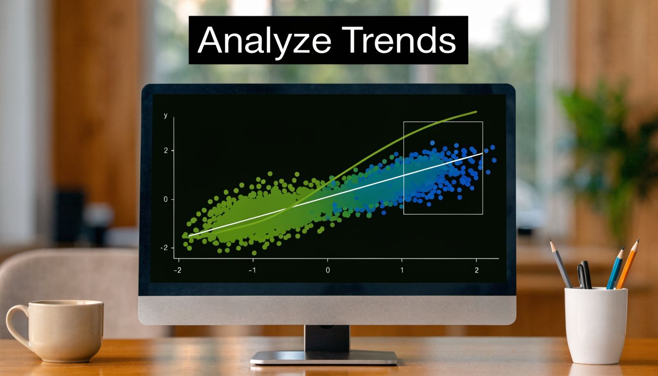
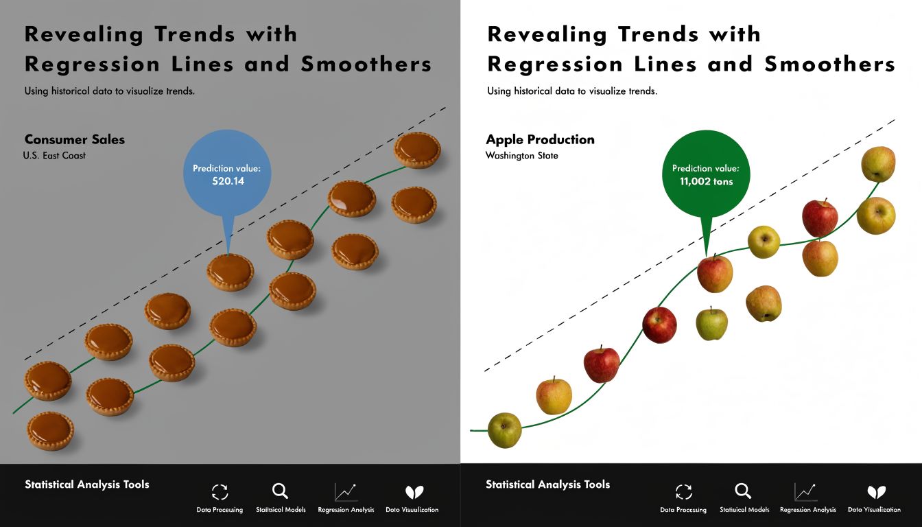
Revealing Trends with Regression Lines and Smoothers
A scatter plot shows all the individual observations. Sometimes that’s enough. Sometimes you want a visual summary of the overall trend.
Trend lines help. They don’t replace the points. They sit on top of the points and make the broader pattern easier to read.
Add a straight line in base R
With the mtcars example, start from your scatter plot and add a fitted line:
x <- mtcars$wt
y <- mtcars$mpg

plot(x, y, pch = 19, col = "gray52")
abline(lm(y ~ x), col = "orange", lwd = 3)
That orange line is a linear regression line. It’s often called the line of best fit.
A useful analogy is this. If your points are footprints across a field, the regression line is the path that best captures the overall direction of travel. It doesn’t pass through every footprint. It summarizes the main drift.
Add a smoother when the relationship bends
Straight lines are simple and often useful, but not every relationship is linear. Some patterns curve, flatten, or change direction.
Adding a linear fit with abline(lm(y~x)) or a LOESS smooth with lines(lowess(x,y)) are two key methods for trend visualization. While lm() is efficient, it can be sensitive to outliers. lowess, which uses locally weighted regression, is more resilient and has a >95% success rate in accurately representing trends in data with outliers or non-constant variance, as described in this R scatter plot tutorial with smoothing examples.
In base R, that looks like this:
plot(x, y, pch = 19, col = "gray52")
lines(lowess(x, y), col = "blue", lwd = 3)
A LOESS or LOWESS smoother acts like a flexible ruler. Instead of forcing one straight summary across the whole chart, it adapts to local shape.
Use a straight line when your main question is “what’s the overall direction?” Use a smoother when your real question is “how does the relationship change across the range?”
The ggplot2 version
You can do the same thing in ggplot2.
For a linear fit:
ggplot(mtcars, aes(wt, mpg)) +
  geom_point() +
  geom_smooth(method = "lm", se = FALSE, color = "orange")
For a smoother:
ggplot(mtcars, aes(wt, mpg)) +
  geom_point() +
  geom_smooth(se = FALSE, color = "blue")
geom_smooth() chooses a smoothing approach automatically depending on the context. For learning purposes, what matters most is recognizing the difference in interpretation.
Don’t confuse trend with truth
A line is a guide, not a verdict. One weird outlier can tug a regression line more than you expect. A smoother can also overreact if the data are sparse in some regions.
If you want to quantify the relationship after plotting it, this guide on calculating correlation in R is a good next step. The plot shows the pattern. Correlation gives you a compact numeric summary of linear association.
Solving Common Problems and Exporting Your Work
A scatter plot looks clean when the dataset is small. Then real work arrives. You load a bigger table, run the same code, and the chart turns into a dark blob.
That problem is overplotting. Too many points stack on top of one another, so the chart stops being informative. This happens often in AI and analytics work where event logs, embeddings, and behavior data can get large fast.
When points pile up
One simple fix is transparency. In ggplot2, lower alpha so dense areas appear darker and sparse areas stay lighter.
ggplot(mtcars, aes(wt, mpg)) +
  geom_point(alpha = 0.5)
The same idea matters even more with larger data. Transparency helps your eye read density instead of seeing one solid patch.
Another fix is smaller points:
ggplot(iris, aes(Sepal.Length, Sepal.Width, color = Species)) +
  geom_point(size = 1, alpha = 0.6)
That won’t solve every problem, but it buys you readability.

When the dataset is very large
A significant gap in R tutorials is handling large datasets (n > 1M points), where naive plotting leads to crashes. Techniques like hexagonal binning with the hexbin package can make plotting 50x faster. This is essential for AI professionals analyzing large-scale data, as 70% of “scatter plot slow” questions on Stack Overflow are from users who lack these production-scale strategies, according to this discussion of large-scale scatter plotting in R.
Hexagonal binning changes the question slightly. Instead of asking R to draw every point, you ask it to summarize where points are concentrated.
library(ggplot2)

ggplot(big_data, aes(x = feature1, y = feature2)) +
  geom_hex()
If you haven’t seen this before, think of it as replacing individual pebbles with a heat map made of hexagons. You lose point-by-point detail, but you gain a clear picture of density.
Practical fixes to keep in your toolkit
- Use transparency first: Lower
alphawhen points overlap. - Shrink point size: Smaller dots reduce clutter without changing the data.
- Try hex binning: Use
geom_hex()when plotting every point becomes impractical. - Sample for exploration: For a quick first look, a subset can help you spot broad patterns.
- Check missing values: Incomplete rows can create confusing plotting behavior.
Export the chart cleanly
Once the plot looks right, save it properly. Screenshots are tempting, but they’re rarely the best option for reports or slides.
With ggplot2, use ggsave():
p <- ggplot(mtcars, aes(wt, mpg)) +
  geom_point() +
  theme_minimal()

ggsave("scatterplot.png", plot = p, width = 8, height = 5)
For base R, one common pattern is to open a graphics device, draw the plot, then close it:
png("base-scatterplot.png", width = 800, height = 500)
plot(mtcars$wt, mtcars$mpg)
dev.off()
Save the plot from code, not by hand, when the image needs to go into a report. Reproducibility matters more than convenience.
A saved plot from code is easy to regenerate if the data change, and that’s exactly the kind of habit that makes your work reliable.
Frequently Asked Questions about R Scatter Plots
Should you learn base R or ggplot2 first
Start with base R if your goal is understanding the fundamentals quickly. One function call gets you from vectors to a chart, and that helps you focus on what a scatter plot means.
Move into ggplot2 when you want cleaner styling, grouping, layering, or publication-ready output. In practice, many analysts use both. Base R is great for a quick check. ggplot2 is great when the plot needs to communicate with other people.
How do you label individual points
In base R, use text() after the plot:
plot(mtcars$wt, mtcars$mpg, pch = 19)
text(mtcars$wt, mtcars$mpg, labels = rownames(mtcars), pos = 4, cex = 0.7)
In ggplot2, use geom_text():
ggplot(mtcars, aes(wt, mpg, label = rownames(mtcars))) +
  geom_point() +
  geom_text(nudge_x = 0.1, size = 3)
Labeling every point can get messy fast, so it’s usually smarter to label only a few notable observations.
What if one axis is a date
R can plot dates, but you need the column stored as a proper date type. In many real datasets, dates arrive as text and need conversion first.
Once the column is a real date, both base R and ggplot2 can use it on an axis. The main thing is to check the data type before plotting. If the axis looks strange, that’s often the reason.
Why does my scatter plot look empty or wrong
A few beginner mistakes show up repeatedly:
- One variable isn’t numeric
- The x and y vectors don’t match row for row
- Missing values are dropping observations
- You mapped a fixed color outside or inside aesthetics incorrectly in ggplot2
When a chart looks wrong, inspect the structure of your data before rewriting the plot code.
Can scatter plots be interactive
Yes. If you want to move from static charts into exploration, packages such as plotly can make an existing plot interactive. That’s useful when you want hover details or zooming, especially with richer datasets.
The key idea is still the same. Whether static or interactive, the plot should help you ask a better question about the relationship between variables.
YourAI2Day helps readers make sense of practical tech topics without the hype. If you’re exploring AI tools, data workflows, or beginner-friendly explainers that connect code to real use cases, visit YourAI2Day for more grounded guides and updates.